Apple’s new flagship lineup, which goes on sale in stores on Friday, features the biggest ever change to the lock screen – precious real estate that had mostly been a wasteland of alerts up until this point. It’s not a new concept; Android has supported an always-on-display for a while but this is a first for Apple. Not only is it a way to keep users more tethered to their devices in a more passive way, the notion of finding something new to do with old space comes as purse-strapped consumers must find a reason to trade in or buy devices without major hardware upgrades.
“This was like an empty garage now being fully utilized,” said Dan Ives, an analyst at Wedbush Securities. “It will clearly increase time spent on the phone. … We view it as a genius strategic move.”
While interactive lock screens are typically limited – allowing for a quick check of notifications, the time, reminders, calendar appointments, and writing notes – Apple is adding more customization and flexibility to the lock screen. It’ll also show, for example, the progress of takeout delivery and an Uber arriving at your home — information previously found only inside apps. (For those who find it too complicated, they can quiet any and all widgets.)
The new lock screen also gives a way to showcase photos, select custom font styles and colors, and provides better placement of notifications now at the bottom of the screen.
“Apple isn’t always first and increasingly they may seem behind the curve, but when they bring something to market, it tends to be very well executed,” said Michael Inouye, a principal analyst from ABI Research.
Inouye, however, believes an always-on display could reduce the amount of time spent on the device, allowing users to do more without having to search through apps and make the most of multitasking. “When it’s only a quick notification on the lock screen and it’s not interactive, that prevents those unanticipated deviations from our initial task,” he said.
Whether the lock screen saves time or pulls a user deeper into a time suck will likely be dependent on the individual. Apple told CNN that what a user interacts with on their lock screen will not impact their Screen Time, the iPhone’s internal tracker that monitors a user’s engagement throughout the week.
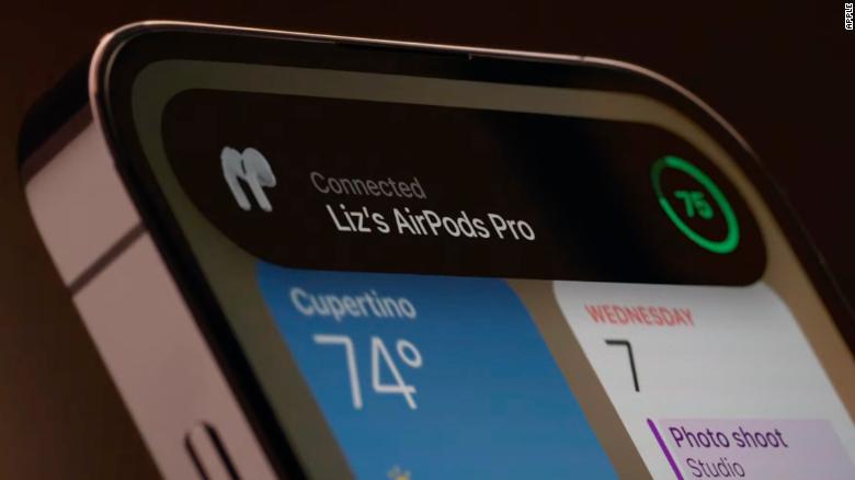
Apple’s new lock screen joins a handful of buzzy changes coming to the iPhone 14 lineup, such as the Dynamic Island, a pill-shaped area at the top of the screen that replaces the much-maligned notch. It enlarges and shrinks when calls come in, music is played or other features are in use.
But much like the lock screen, Apple is trying to get the most out of what minor areas have largely been untouched for years.
“These are all things companies are doing to show improvements when it’s becoming increasingly difficult to do so from the hardware side,” Inouye said. “Even though the hardware certainly makes advancements, from most consumers’ perspective they aren’t going to notice the differences in their normal day to day usage. But these changes are noticeable.”


